INTRO
Medical Marketing Community is a professional network that connects healthcare marketers, business owners and medical experts in Ukraine.
The goal of this project was to design a website that introduces the community, communicates its value and creates a strong foundation for its future digital platform.
ROLE
UI/UX Design
TOOLS
Figma
PROCESS
The process started with a project brief, followed by a stakeholder interview with the community team and their marketer to better understand business goals, audience and expectations.
Based on these insights, I defined the website structure and explored how it could scale into a future platform. This included creating a sitemap that separates public-facing content from potential member-only areas.
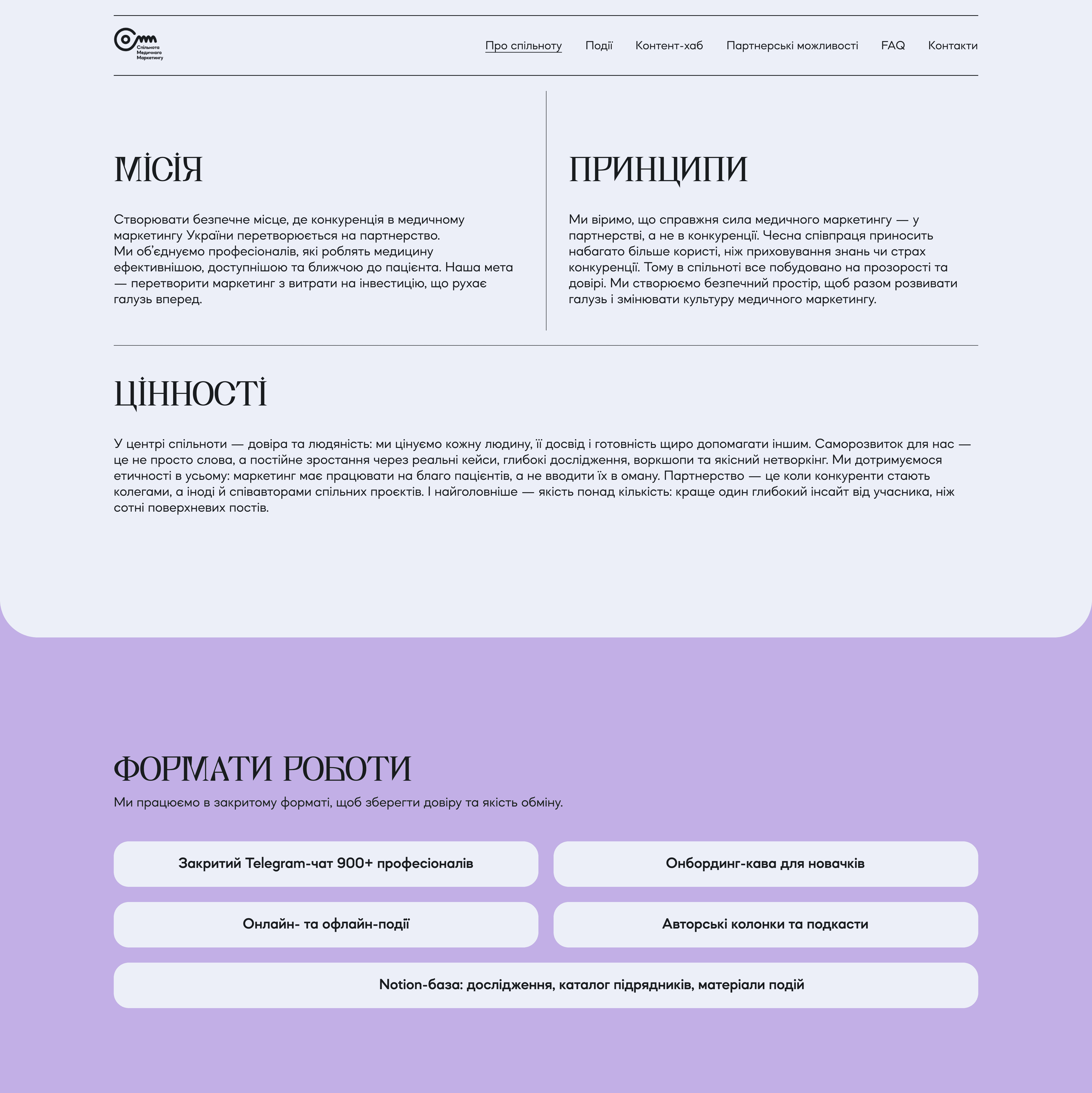
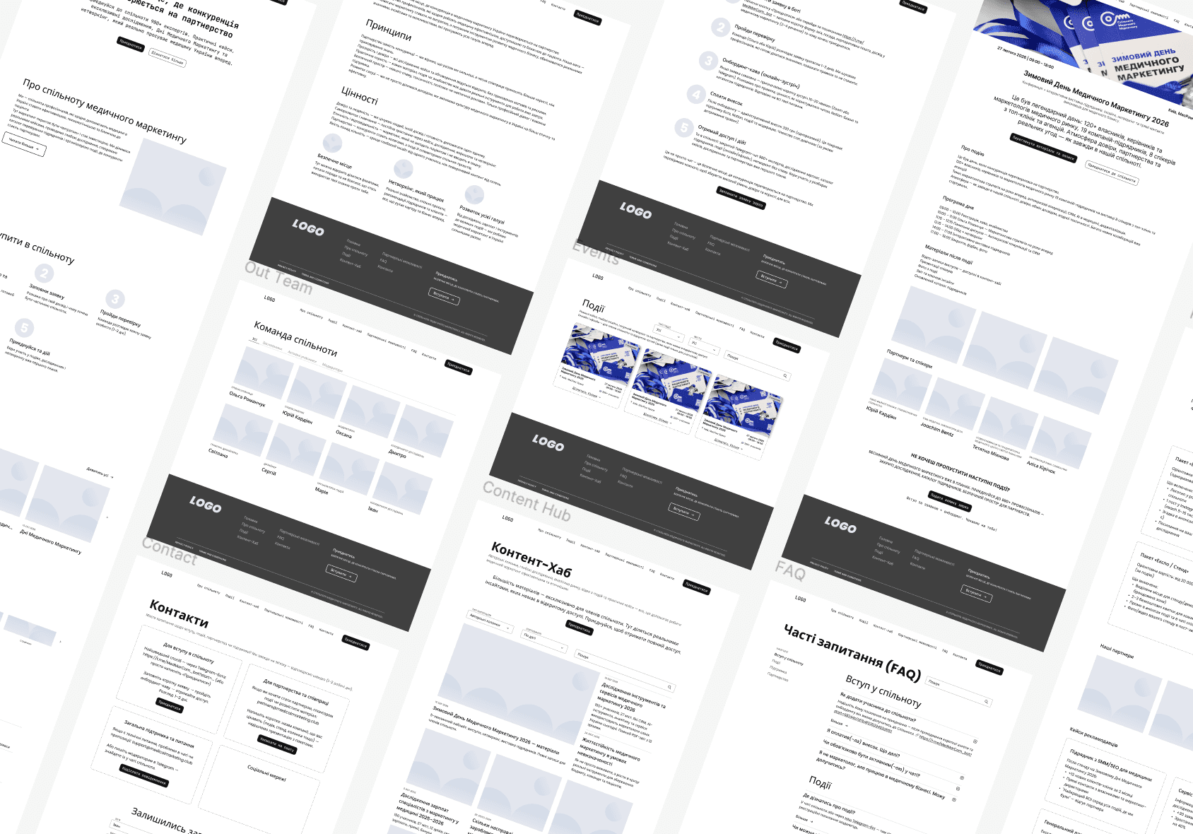
I then developed wireframes for the main public pages, focusing on content hierarchy and clarity. The goal was to simplify navigation and guide users toward key actions, such as exploring events and joining the community.
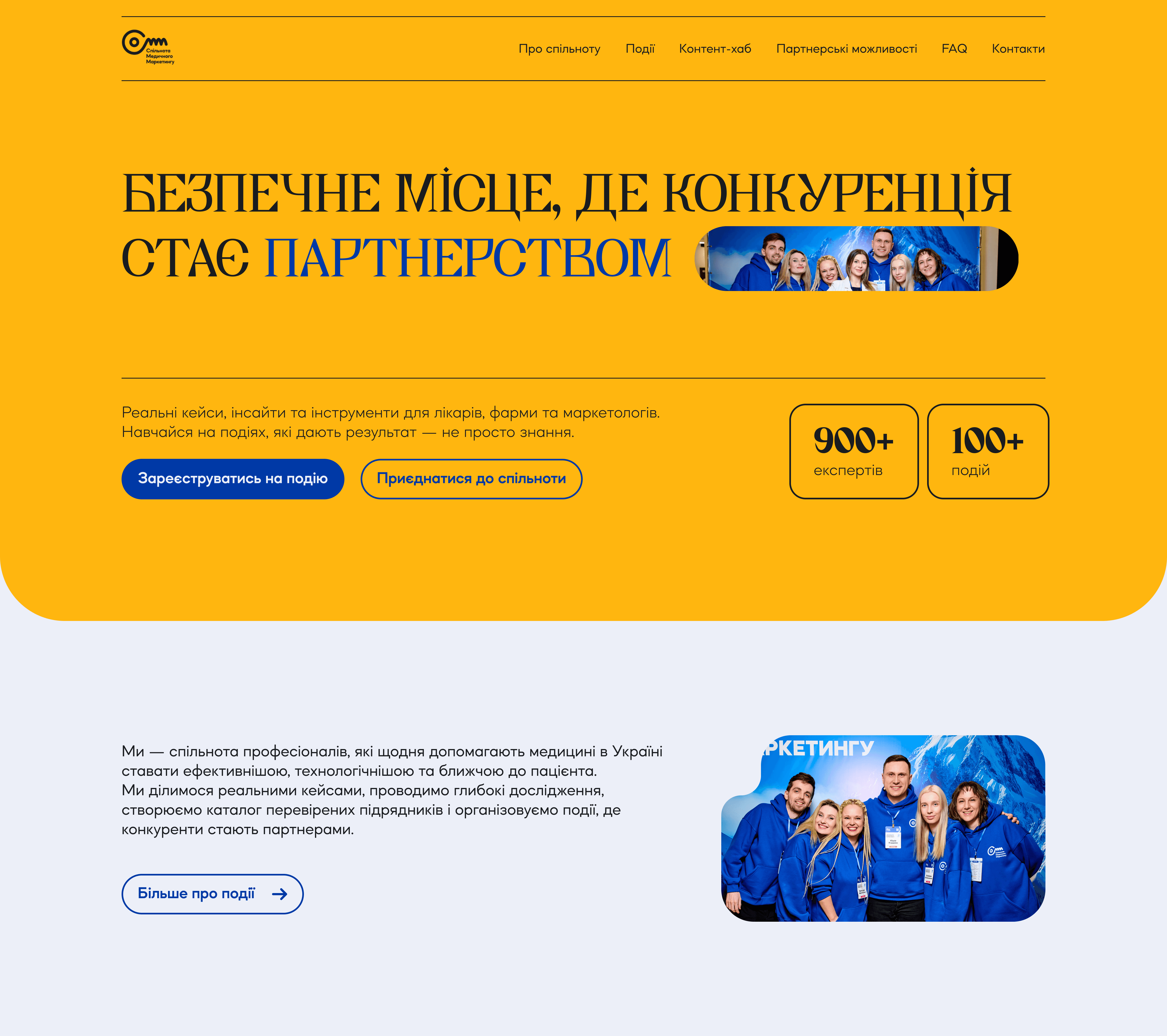
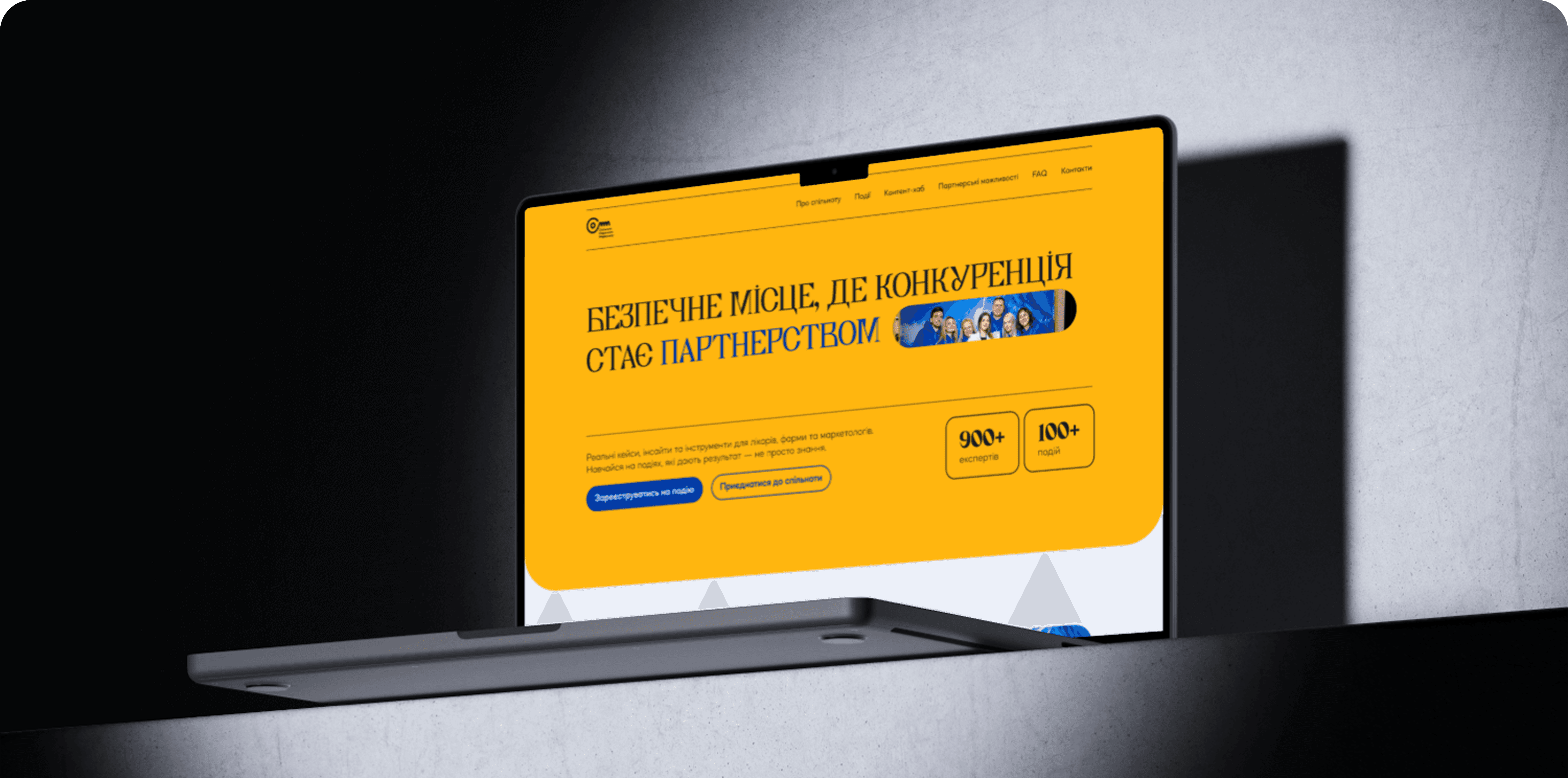
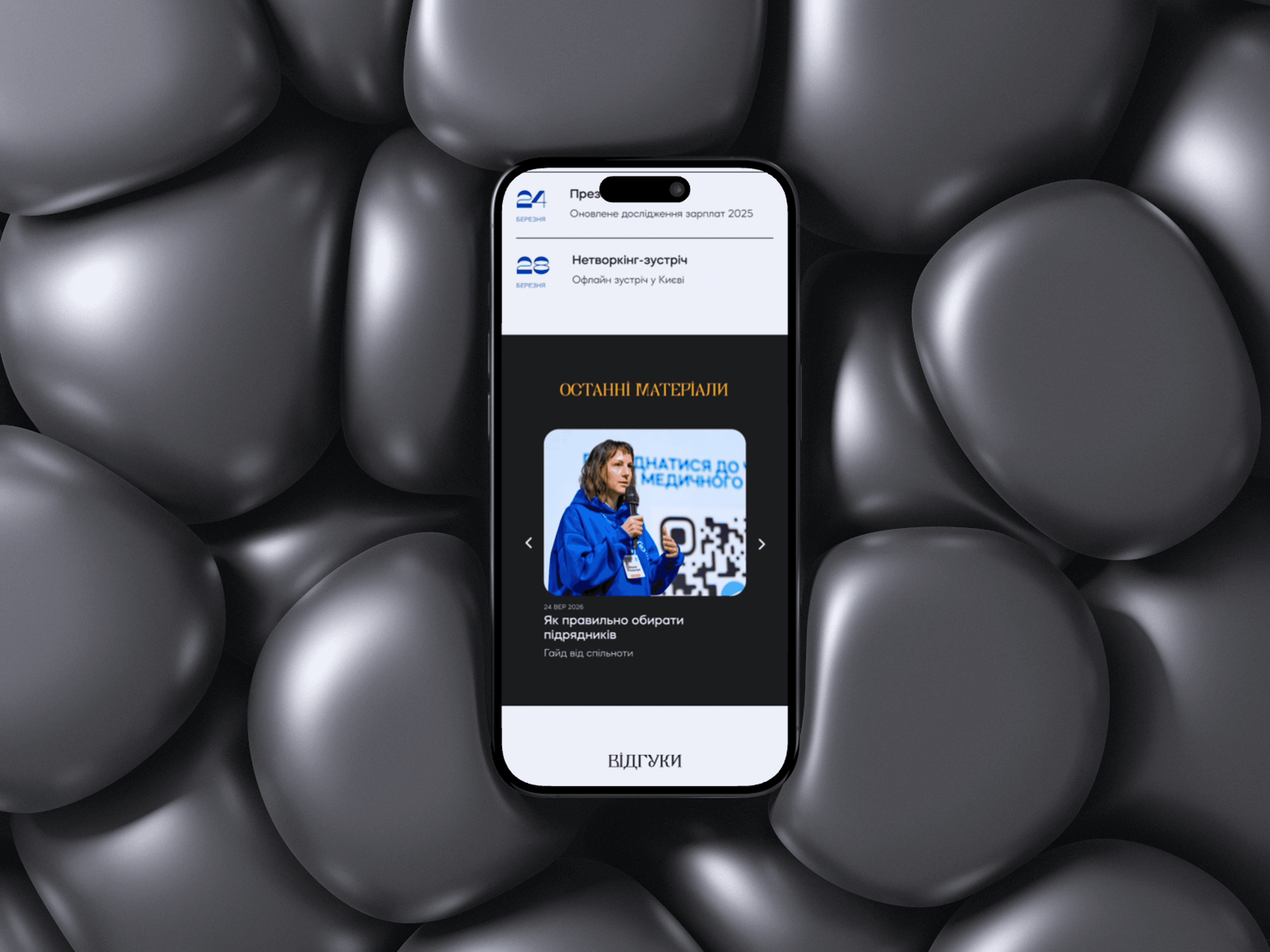
After that, I created a visual concept based on references and brand direction, combining structured layouts with expressive geometric elements.
The UI design evolved through an iterative process, refining layout, hierarchy and visual balance to improve readability and user flow.
DESIGN DECISIONS
Trust through real people
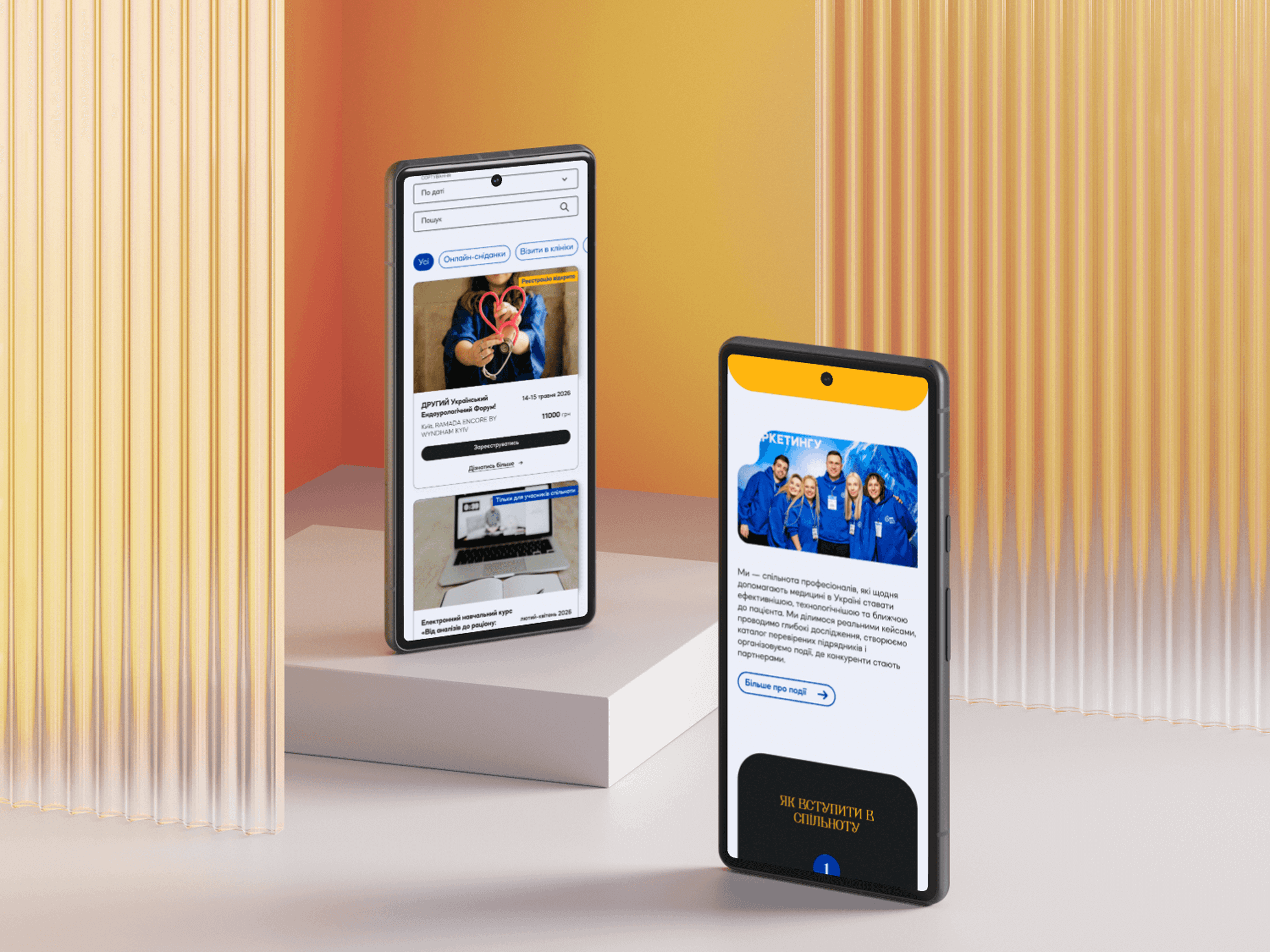
I used real photos of community members across the website to emphasize that MMC is an active and authentic community. This helps build trust and creates a stronger emotional connection with potential members.
Strong and recognizable visual identity
The design uses bold brand colors and visual elements to create a distinctive and memorable identity. Based on stakeholder preferences, I avoided pastel tones and gradients, focusing instead on solid, high-contrast colors to achieve a more confident and modern look.
Balancing creativity and clarity
While the visual style is expressive and colorful, the layout itself remains simple and structured. This decision was made to ensure clarity and usability for a professional audience, including healthcare specialists and business owners.
Content hierarchy and simplicity
Due to the amount of content, I focused on keeping the structure clean and easy to scan. A simple layout helps users quickly understand key information without feeling overwhelmed.