INTRO
"What is flying?" is a mobile app for iOS that delivers real-time air raid alerts with context — not just a siren, but what's flying, where from and what to do. Designed for people under stress, the interface prioritizes speed of comprehension over information density.
ROLE
UI/UX Design
TOOLS
Figma

PROCESS
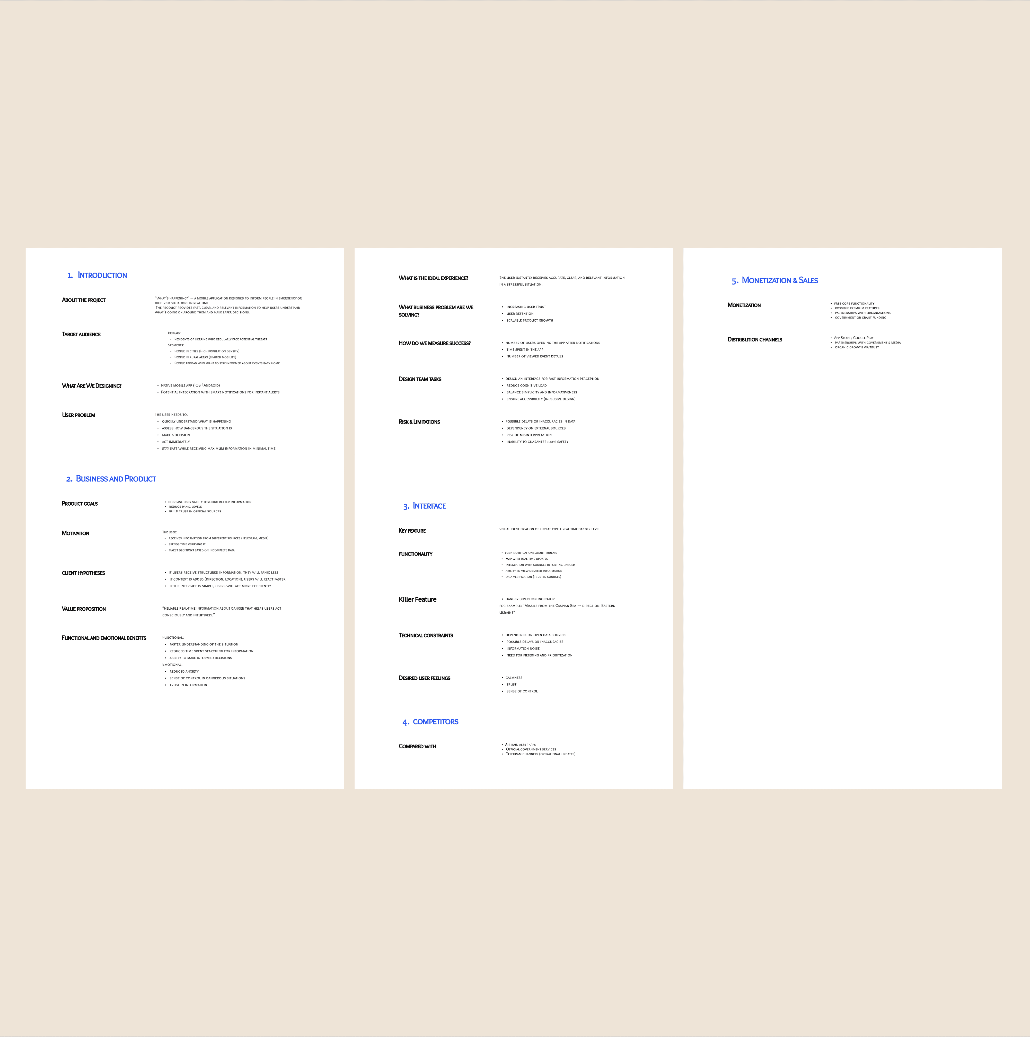
Research: identified key pain points — users don't understand threat context, existing apps cause panic
Defined design strategy: Informative, but not stressful
Created user flows for onboarding, alert states and map view
Iterated on alert screen hierarchy — one primary action at all times
Added Apple Watch integration for faster awareness

DESIGN DECISIONS
1. Two-mode color system Calm pastels for safe state → saturated red for alert. Color communicates status before text is read.
2. Cornflower animation Subtle looping illustration on the safe screen — reduces anxiety, adds Ukrainian identity without being decorative noise.
3. Context over alarm Every alert shows source + direction (e.g. "Caspian Sea → west Ukraine") — turning panic into understanding.
4. Single primary action Alert screen always has one dominant CTA: "Find shelter nearby." Everything else is secondary.


REFLECTION
This project taught me that designing for high-stress situations means removing decisions, not adding features. Every element either helps the user act faster — or gets cut.